Progressive Insurance logo
Log In
Logo
Overview Surround Space Logo Misuse "P" Logo Mark
Flo
Mark of Flo
Color
Primary Palette Full Palette
Type
Icons
Primary Icons Secondary Icons Utility Icons Product Train
IllustrationPhotographySocial ChannelsDesign SystemsAccessibility
Brand Behaviors
Copy Style Guide
Brand Voice AP Stylebook Writing FAQs
Spanish Language GuidelinesDEI GuidelinesAI Guidelines
Character Writing
Flo Jamie Mara Alan Dr. Rick
Reference Library
Savings / Discount Claims Trademarks Coverages Acronyms Glossary
Agency
Agency B2B Distribution Commercial Lines B2B Rewards and Incentives Platinum Platinum Reserve℠ Progressive Priority℠
Commercial Lines
Small Business Heavy Truck Snapshot ProView® Commercial Lines: B2B BQX
Direct / Personal Lines
Special Lines Snapshot® Snapshot Road Test® Snapshot ProView® AQX & HQX
Strategy Group
AP Products Level20 Products

Progressive Insurance | Brand Guidelines

•The Business•Direct / Personal Lines•Snapshot®

Snapshot®

In 2008, we introduced Snapshot to consumers and customers—one of our first forays into user-based insurance (UBI). UBI is an opportunity for consumers and customers to personalize their auto insurance based on their actual driving, with the rates determined by things like hard braking, amount of time driven, time and day, fast starts, trip regularity, and distracted driving.

Snapshot®, Snapshot Road Test®, and Snapshot ProView® are all separate UBI products that share the name Snapshot but are marketed to different audiences. The three products share some components, like color palette. However, each product has some individual differences, so be sure to pay extra attention!

Snapshot ProView is the UBI program for small businesses introduced by Progressive in 2018. The audience is made up of microbusiness small business owners with one to five employees and one to nine vehicles. They have a commercial auto, but may or may not have insurance with Progressive. Many of our customers fall into the following categories:

  • Landscapers
  • Carpenters
  • Electricians
  • Realtors
  • Snow plowers
  • Painters
  • Bakers
  • Architects
  • Contractors
  • Cleaning services
  • Florists
  • Accountants

EXPLORE

LogoColorTypeIconographyPatternsPhotographyIllustrationBrand BehaviorsResources

Logo

Display the logo in a positive format (for print, PANTONE® 2935; for digital, #0077B3 (Blue 700); or black) or in a negative format (in white, reversed out of another color). Use a negative format only when the background area is larger than the minimum surround space. One way to protect our logo is by putting a registration symbol (®) next to it—particularly on materials seen outside the company. You don’t need to use a registration symbol on promotional items, signage, or internal documents. The registration symbol should be used in the first mention of Snapshot if the logo isn’t included in the design.

Snapshot_Logo_2022.jpg
Snapshot_Logo_2022_White.jpg
Snapshot_Logo_2022_Black.jpg

Surround space

Space around the logo helps you see and recognize the logo easier. Minimum surround space should equal the height of the logos “p.”

snapshot-surround.cf904ce.png
Download logos (.ZIP)

Color

When in the digital space, remember to always double-check you’re meeting WCAG AA accessibility standards (or above) by using a miniumum contrast checker.

Blue 700

HEX: #0077B3

RGB: 0, 119, 179

CMYK: 100, 47, 0, 0

PANTONE: 2935 C

White

HEX: #FFFFFF

RGB: 255, 255, 255

CMYK: 0, 0, 0, 0

Minimum Contrast Checker

Type

96 Sans is our custom typeface which gives us a completely unique brand identity. It also gives us a way to tie the look and feel of our brand identity across all creative pieces. For a more detailed breakdown of the nuances of type styling, see the full version of the Snapshot Brand Identity.


Headlines

96 Sans Bold

Sentence case

Black

With Snapshot®, safe drivers can save.

Subhead

96 Sans Bold

Sentence case

PMS 5405 / Steel Blue 700

It’s easy to drive toward a discount and great savings.

Body Copy

96 Sans Light

Sentence case

Black

Traditional car insurance rates are based on factors you can’t control, but Snapshot personalizes your rate based on how you drive, how much you drive, and when you drive. In fact, through the years, we’ve handed out over $900 million in discounts to our customers.

Iconography

Icons translate our products into bite-sized, visual nuggets. Like everything else, they are an important communication aid and have guidelines to ensure they make the best impact. Before working with iconography, check out our icon best practices.

Snapshot brand icon

This is our main Snapshot icon. It has a stroke weight of 1px and is typically used between 50-100px or larger. This icon was primarily created to be used within the digital space via the Progressive app. It should be used rarely on other platforms and mediums. In most cases, use the Snapshot logo instead.

1_Snapshot_RGB.png

Primary icons

Modeled after the primary icon style for the Progressive master brand, Snapshot has its own specific set of icons. These icons should be used at no smaller than 100px. Do not change the color or stroke weight.

1_Snapshot_Device_RGB.png
1_Return_Device_RGB.png
1_Phone_Location_RGB.png
1_Results_RGB.png
1_Improve-Time_of_Day_RGB.png
1_Improve-Weekend_RGB.png
1_Keep_Driving_RGB.png
1_Monitoring_Paused_RGB.png
1_Improve-Red_Light_RGB.png
1_Improve-Hard_Brake_RGB.png
1_Improve-Fast_Acceleration_RGB.png
1_Fun_Fact-Status_Trips_Completed_RGB.png
1_Fun_Fact-Status_Distance_RGB.png
1_Grade_A_Plus_RGB.png

Secondary icons

These simplistic icons can be used at smaller sizes, as they have minimal details. They should be used at no smaller than 50px. Again, do not change the color or stroke weight.

4_Transit_Mode_Ride_Share_RGB.png
4_Transit_Mode_Public_Transit_RGB.png
4_Transit_Mode_Foot_RGB.png
4_Transit_Mode_Passenger_RGB.png
4_Transit_Mode_Airplane_RGB.png
4_Transit_Mode_Bicycle_RGB.png
4_Transit_Mode_Driver_RGB.png
4_Improve-Time_of_Day_RGB.png
4_Improve-Mileage_RGB.png
4_Improve-Harsh_Acceleration_RGB.png
4_Improve-Hard_Brake_RGB.png

CL-Specific icons

Snapshot ProView iconography additionally includes small business-specific CL product icons. For more information on using CL icons, see the Commercial Lines page.

1_Passenger_Van_RGB.png
1_Pickup_with_Ladder_RGB.png
1_Ice_Cream_Truck_RGB.png
1_Cargo_Van_with_Ladder_Rack_RGB.png
1_Food_Truck_RGB.png
1_Auto_RGB.png

Patterns

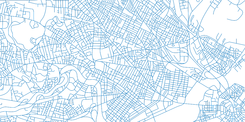
These city monoline patterns (of Chicago and Boston) represent the trips our customers take while using Snapshot. These patterns should be used as secondary, textural elements, or as larger graphics on simpler layouts.

Snapshot_Maps_Boston.png
Snapshot_Maps_Chicago_Reversed.png

Photography

The photography should feature authentic, casual, and airy imagery that reiterates Snapshot’s ease of use.

Environmental considerations

  • This can include candid shots of people driving or with their vehicle.
  • Be mindful of which side of the road the driver is on, along with the markings (avoid European roads).

Device and mobile considerations

  • This imagery should highlight the Snapshot device or app. Photography should show the simplicity of using Snapshot.
  • Do not show consumers using their phone while driving.
20B40141_BACON_ARCHITECT_0453-Edit.jpg

Illustration

STAY is the name of our service platform with a goal of helping customers stay with Progressive as their needs change. The Chris Anderson STAY illustrations include specific Snapshot versions. These illustrations highlight the easy-to-use Snapshot app and device and can be used across all mediums—when used, they should be the primary focus.

VIGN_Driving_Car_Phone_Dashboard_Snapshot_Auto_Brand_Illustration.jpg

Brand Behaviors

Let’s ‘talk’ about Snapshot ProView

We use all seven brand behaviors to create the PGR voice for our Small Business Owners who use Snapshot ProView. However, based on past Snapshot ProView projects, we’ve found that we circle around the following behaviors the most:

Optimistic

Small Business Owners are burning the candle at both ends. When we have a chance to talk to them, we should convey a sense of positivity—sending them encouraging thoughts even if there’s a hiccup along the way.

Clear

Small Business Owners have a lot going on in their day-to-day. That’s why we need to be as concise, direct, and empathetic as we can when talking to them—using plain, easy-to-understand language when explaining products, policies, claims or any other answers we can offer during their journey with us.

Helpful

To a Small Business Owner, insurance is a necessity more than a main focus of their business. But, when they need our assistance, we need to shine by offering friendly, pleasant, solution-oriented advice to them along the way.

Keeping it simple: Creating content for PGR

When it comes to writing—whether it’s body copy, headlines, articles or more—one of our general guiding principles for all Progressive communications is to keep it simple. To cut out all of the clutter, bring the main message to the forefront, and keep our content as simplistic and easy-to-read as possible.

That’s why we’ve put together a number of questions for writers, designers, and content creators to ask themselves before, during, and after the creative build:

  • Can my message be delivered more succinctly?
  • Can any elements be removed from the layout?
  • Is my vocabulary as clear and direct as possible?
  • Can the content be made more scannable and easier to read?
Visit the Brand Behaviors page

More resources

Visit the DAM portal
Download PDF of Snapshot Brand Identity
‹Commercial LinesDirect / Personal Lines›

Resources

  • Brand Contact
  • Progressive.com
  • Accessibility
  • Technical Help
  • Developer Changelog

Terms & Privacy

  • Privacy & Security
  • Terms of Use
  • CA Notice at Collection
  • Do Not Sell or Share My Personal Information (CA Residents Only)

Copyright 1995 - 2026 Progressive Casualty Insurance Company. All Rights Reserved.